[ad_1]
Amazon QuickSight is a serverless, cloud-based business intelligence (BI) service that brings data insights to your teams and end-users through machine learning (ML)-powered dashboards and data visualizations that can be accessed via QuickSight or embedded in apps and portals that your users access.
Line charts in QuickSight have undergone a major overhaul this year, starting with an increased limit on the number of data points that can be rendered in a single chart from 2,500 to 10,000 points, followed by missing data treatment, and finally ending this year with line and marker customization options.
With the new styling options, you can make line charts more readable and drive readers’ attention towards the line series you want to emphasize. Although colors help convey meaning, in certain cases choosing different line patterns could help differentiate between lines for people with color blindness, and making lines bold could make them stand out from the rest. Some enhancements like step line interpolation are more than a styling feature, where you can display step lines for data that changes at a specific point in time and at irregular intervals. For example, if you were to build a chart of postage stamp prices in the US, a step line would be preferred than a slope to indicate change in price. The line between the dates would remain flat until the next price change is observed.
In this post, we discuss the updates to the line chart customization options and their benefits.
Line chart format pane updates
The data series section under the format pane has been updated with a new flyout menu consisting of line styling, marker customization, and axis settings. Authors can choose to set a base style, which is a common style across all series, and also customize individual series by either choosing Select Series to Style or by directly selecting the series on the line chart on the sheet. Previously, the long list of series names made it difficult to track series where the axis setting was changed. This has been updated to only display individually styled series. Also, you can remove and reset to default styling if you wish to go back to the previous style.
The following figure compares the old and new experience.

Line styling
The data series tab, where users adjust axis placement (left and right Y axis), now also includes options to style individual series or all series in the line chart and change presentation options. For example, you can create a dot plot chart in QuickSight by hiding the line series and displaying only markers.
Let’s look at the recently added line styling options:
- Line interpolation – Allow authors to choose between linear, smooth, and stepped line interpolation options:
- Linear – The most commonly used line interpolation for trend analysis.
- Smooth – A variation of line charts, which connects the data points using smooth curves instead of straight lines. Apart from the aesthetic aspect, these charts are preferred for displaying a gradual change in trends and where data accuracy isn’t critical.
- Stepped – A specialized version of the traditional line charts, where the data points are connected via step-like progressions instead of straight lines. You can use stepped lines to view sudden and exact time of changes in the data, where the vertical lines represent the magnitude of the changes and the horizontal lines represent periods of time where data is constant. You can also use this approach to create bump charts, which are commonly used to visualize changes in rank over time.

- Line style – Another way to make your line charts more accessible and printer friendly is to define line styles to differentiate between series. A classic example would be visualizing actual and target values across a given time period. You can choose between solid, dotted, and dash line style.

- Color customization – Colors play an important role in conveying meaning and driving user attention. Although defining a distinct color for each series helps distinguish between the different series, doing the same for a large number of series could add visual clutter. As part of best practices in such cases, highlighting certain series makes it easier for readers to focus on the important information, especially while viewing a large number of line series.

- Line width – You can choose from predefined line widths to easily differentiate between line series and let important values stick out to drive reader focus. In the following example, we’re interested in showing the seasonality trends for gardening and home decor in relation to other parts of the business. To do that, instead of assigning each series a different color, we might only adjust color and increase thickness for gardening and home decor and keep other series as grey and thin. This way, reader attention is easily drawn towards the thicker, colored lines.

Marker customization
Data markers help draw attention to the data points along a line. They also come in handy when showing which data points are covered by your data in case your line chart contains missing data points. Data markers can be enabled for all series or individual series. When enabling data markers for all series, you should be judicious to avoid visual clutter and draw attention to too many elements.
These new customizations enable new use cases such as dot plot charts (hide line series and display only markers) and slope graphs. Data point markers will only show up for data points where data exists and not for interpolated values using the missing data control. The following are the marker properties:
- Shape – Choose from a predefined list of marker shapes like circle, diamond, or square.
- Size – Define a size for the marker. Note that the marker size should be greater than the line width to be visible.
- Color – By default, markers are assigned the same color as individual series. However, this can be changed as desired.
How to style lines and markers
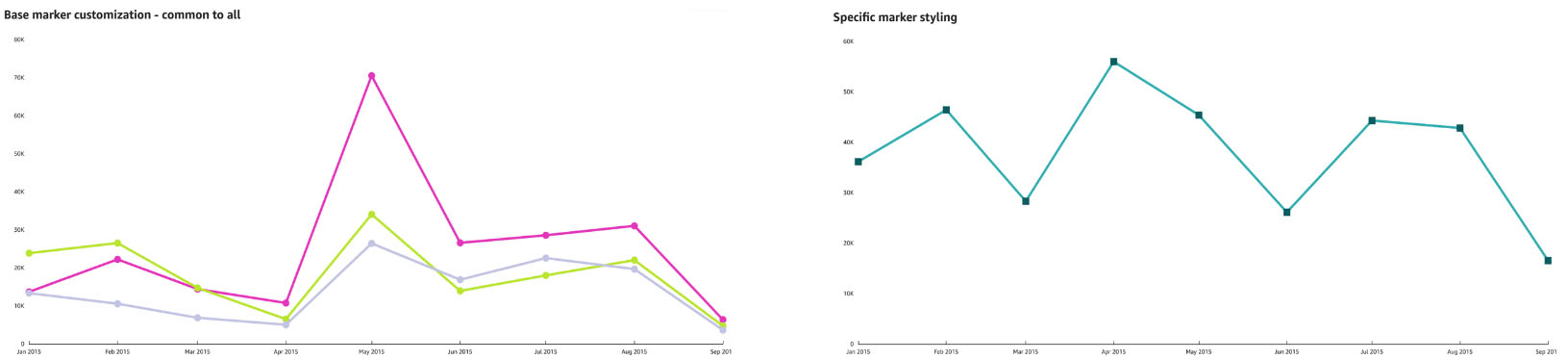
Create or choose a line chart that you want to style and choose the pencil icon to open the Format visual pane. Navigate to the data series section and select the base style to apply common styling options to all series—color toned down to light grey and line interpolation as smooth.
Summary
In this post, we looked at the new line and marker styling options for line charts and how you can apply a common style across all series as well as style each series individually. We also looked at the different ingress and Y axis placement options. Learn more on how to use small multiples in QuickSight To learn more, click here
We look forward to learning more about your interesting use cases and feedback on how we can better serve you! Follow the QuickSight Community to stay up to date with new feature announcement, events, learning center, and questions and answers.
About the author
 Bhupinder Chadha is a senior product manager for Amazon QuickSight focused on visualization and front end experiences. He is passionate about BI, data visualization and low-code/no-code experiences. Prior to QuickSight he was the lead product manager for Inforiver, responsible for building a enterprise BI product from ground up. Bhupinder started his career in presales, followed by a small gig in consulting and then PM for xViz, an add on visualization product.
[ad_2]